8 Points Why the Grid Layout will Benefit You
Since the release of Windows 8 and 10, the new grid look has boomed everywhere in the design world from webpages, smartphones and other user interfaces to magazines, architecture, art and just about anywhere you turn. But why is it that this simple line of rows and columns has become such a fundamental staple?
Simply put, grids promote a clean, structured design and user-friendly navigation with a handful of other benefits you might not have considered. Every designer may have their own reasons for using a grid today, but if you are still hesitant of this clean and simple look, here are some motives why this could significantly improve your repertoire.
1.) Grids Create a Fresh Structure.
A chief aim of lining up your elements in a grid format is creating a clean and organized space. Structure and symmetry are naturally pleasing to the eye. Just take a look at nature like beehives, flowers or fruit. The harmony and structure are attractive and have long inspired artists and architects around the world to mimic its symmetry, like Antonio Gaudi’s Cathedral in Barcelona.
We are naturally pulled toward order and tend to feel at ease when we see things that line up. Just imagine, for example, the difference of going into a disorganized room and entering a place where there is a clear, defined space for everything. Not only would you find things much faster in the latter, but you would also have space to breathe and be comfortable.
You can apply this same analogy when entering a website. Rather than being overwhelmed by many different options and wildly clicking around to find what you are looking for, you can instead choose a graceful and modest structure that provides easy navigation.
In short, the grid helps create a neat and organized space. Just take a look at some of these examples:
Windows 8


2.) Easy to Create and Navigate.
Grids not only get rid of clutter, but they are uncomplicated to design and save you time on coding or organizing your design. You don’t have to be an expert designer or webmaster to use a grid. Nowadays, it’s a piece of cake to design a well-functioning website.
In part, this is because a grid acts as a design guide helping you to decide solely where to place, scale and position elements. Troy Templeman explains that it “helps designers decide where content should be placed rather than where it could be placed.”
A grid means you don’t have to start from zero. In architecture, it would be like already having the structure of the house built. You only need to walk in and decide where to place the furniture. Getting the construction out of the way will certainly save you time, but you’re not totally off the hook just yet. Houses need interior designing, so you still have plenty of space to unpack your creative mind. There are several options to make a grid unique and quite beautiful.
3.) Don’t Sweat the Hierarchy
Some assume that using a grid takes away all hierarchy since all the elements are the same size. Not so, if you correctly use the grid by combining blocks.
Taking our house analogy from before, the grid is like your house with rooms for you to design. Perhaps though, you decide you want to tear down a wall and combine the kitchen and dining room. No big deal, you can construct bigger spaces and make areas stand out. In this way, grids actually make it easier for you to create hierarchy. Take a look at the examples below. Note that they all have the same basic structure, but each grid is broken up individually, highlighting different segments.


To give you more of an idea what this would look like, here are some templates with this same structural idea:


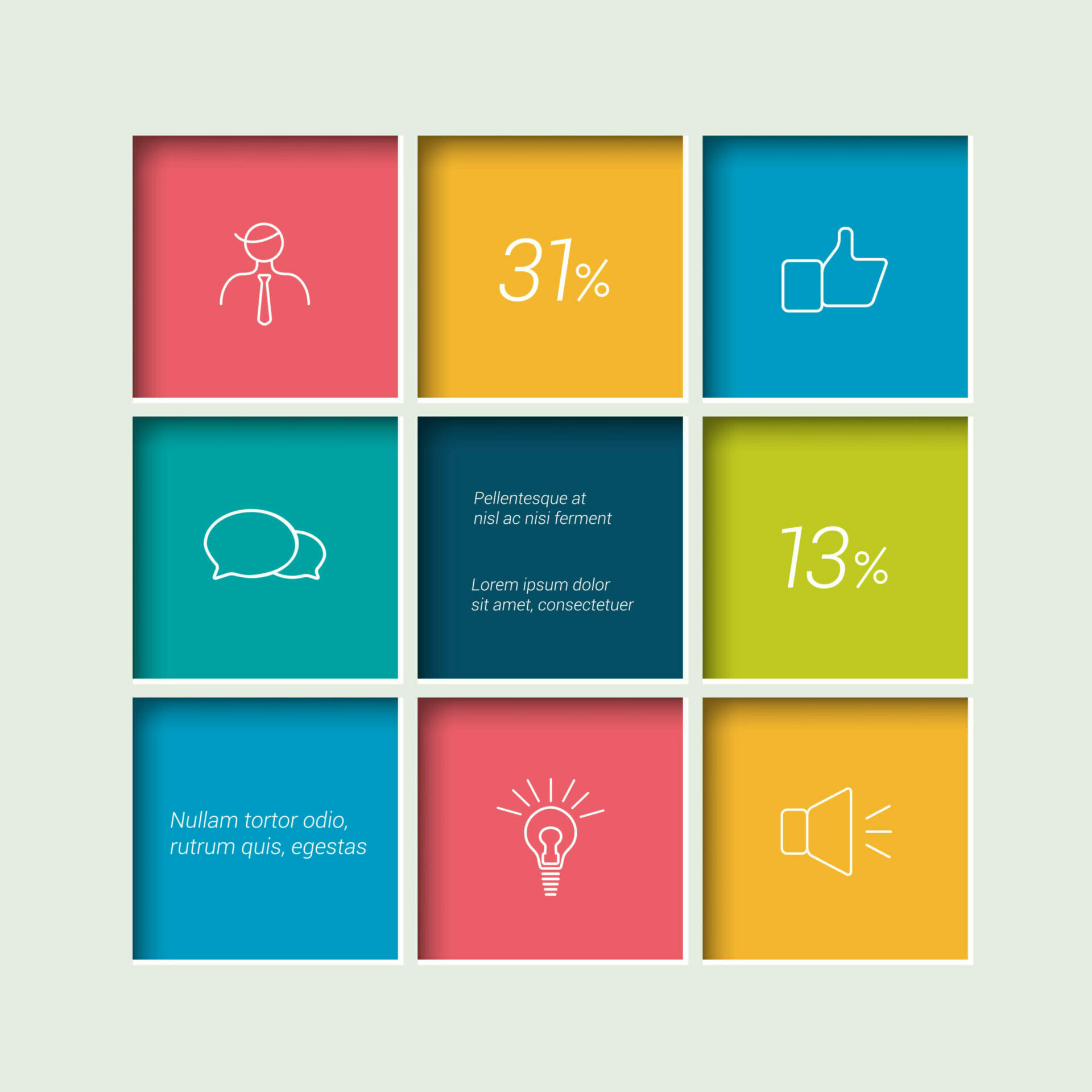
4.) Make Infographics With No Effort
Another great benefit of tiles is that you can easily integrate different elements like pictures, numbers, and text (like the examples shown above). Taking this a step further, you can actually make your own infographics using a grid. Just place numbers and descriptions in different tiles and voila! There’s nothing to it. Here are some samples from PresentationLoad’s Infographics – Numbers template:


5.) Structured, but Original.
Occasionally, you can also break away from the grid entirely to give an extra eye-catching impression. This is a great way to draw attention to individual content, but should be sparingly used.

6.) Balance is Ingrained.
One of the beauties of grids is its portrayal of balance. It establishes equilibrium with its symmetrical layout, which you can use to balance out your elements and decide if one side overpowers the other.

The grid principle is also commonly used in art and photography to understand the balance point. Have you heard of the rule of thirds? The canvas is divided into three columns to help the focal point sits on these points.
7.) Grids Help Lineup Everything.
Art, photography and design give us another lens on how to apply the grid and understand the balance point. Have you heard of the rule of thirds? The canvas is broken into thirds, so there are nine parts and the points of interest are placed on the intersections.


Rule of Thirds in Photography: The Essential Guide
The use of a grid here is slightly different. We are not filling the individual tiles, but looking at how our content is balanced. This is an excellent way to proof any layout, design or presentation you make. Here are some examples of PowerPoint templates:


8.) Grids are Highly Flexible.
Are you concerned that the simple square layout won’t be suitable for more elaborate and substantial content? Grids are adjustable and can help you organize a jigsaw of information. Just add more rows and columns, for the more blocks you have, the more flexibility you will have. So whether you are writing a news briefing, a business report, showing business analyzes or preparing a presentation, the grid can work wonders in being arranged at a glance.
Here are some popular layouts you’ve probably come across. Did you realize they use the grid?


Bonus: Dare to go Diagonal?
Want to try something different? Grids can work just as effectively on a diagonal axis. This can add a stylish look to any poster or print production, and be a sophisticated design choice for a website or presentation.


So, Why Grid?
The most prevailing reason to stick to a grid design is better user experience. Your items will line up easily, content or text won’t float around or be irritatingly minimally off line, and you can still be as creative as you wish to be. Grid makes life easier, especially in a busy business day where you want to get work done. And for the creative minds, you also don’t have to feel conformed as you can configure your space in whatever way you want and you can occasionally breakout or even go diagonal. Grid is simple made and simple to use.
Share this post

-

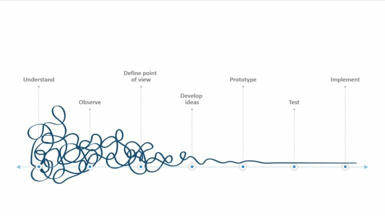
Design Thinking: Problem Solving with a Difference
-
Why Corporate Mission Statements Are So Important
-
7 Tips & Learnings from the Apple Keynote

-
Design Thinking: Problem Solving with a Difference
-
Why Corporate Mission Statements Are So Important
-
7 Tips & Learnings from the Apple Keynote