Fonts in PowerPoint – Get the Best out of Your PPT with the Right Font!
Legibility and style are key in creating a convincing PowerPoint presentation. But it’s not just a stylish font that counts – text also needs to be organized so it’s easy for an audience to follow.
Knowing how to best use PowerPoint’s text boxes and fonts will go a long way in reinforcing the core message of your presentation. In this article, you’ll get lots of tips and tricks to help you master the use of fonts in PowerPoint.
What kind of fonts do you use? Are they serious, modern or bold? Which font combinations work best? Why are fonts so crucial in PowerPoint? Keep reading for practical tips and examples.
Typefaces: a quick summary
After Johannes Gutenberg invented standardized letterpress printing in the mid-15th century, mass communication experienced a major boom. Throughout the years, different typefaces and fonts have developed from different trends and intentions. They fall into three main font families: serif, transitional serif and sans-serif.
Serif font family: A serif is a decorative stroke that finishes off the end of a letters stem (sometimes also called the “feet” of the letters). The serif typeface, or font family, was the first typeface used for mass production. The letters were made up of separate individual parts that had to be assembled to fit together.
The serif typeface was purposely designed to resemble handwriting. However, due to its comparatively poor legibility, it is used today more as a decoration.

Transitional serif font family: Traditional serif is a more modern version of the serif typeface. The individual letter strokes are still finished off by serifs. But its bold, block-like structure makes the transitional serif font family far more legible than its predecessor. As a result, this typeface family quickly became a favorite of the 19th century.

Sans-serif font family: Officially, the first sans-serif typeface was published in 1896. From then on, this minimalist typeface quickly gained in popularity. It was particularly popular in the technical field. Following the global evolution of this field, sans-serif fonts became widely used and world-renowned.

Current versions of these fonts are standard in Windows and are all available in PowerPoint. An added bonus is that they’re recognized by most computers and look the same no matter how they’re used. This guarantees a degree of visual consistency.
Now that the different font families have been introduced, it’s time to start thinking about finding the right fonts for your PowerPoint presentation.
Popular fonts in PowerPoint
Since the 1980s, Arial has been the standard font in many presentations. It was developed by Robin Nicholas and Patricia Saunders who wanted to design a font that was particularly suitable for on-screen presentations. As a result, it quickly established itself as the standard Windows system font and held this position for over 20 years.
In 2013, Arial was officially replaced by the newer Calibri. According to many contemporary typographers, Arial now looks disproportionate and outdated.
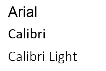
The standard: Arial
Companies often argue that since Arial is installed on all computers and can be used everywhere, it should be used as the default font. Of course, there’s nothing technically wrong with using Arial as a standard font – it’s used not only in PowerPoint presentations but also in Word and emails.
But there is an increasing trend to consciously choose a font that stands out from others. First and foremost, the font must match your corporate design. Many companies have embedded their own brand fonts in their design, which they use primarily in marketing and communication.
Pros and cons: Arial is solid and strong, which enhances legibility. But Arial can quickly make slides with text blocks, bullet points and about 400 words per slide appear overloaded. Because of its dark-gray scale, the font can look as if it has been highlighted in bold, which can come across as heavy and too forceful.
People have widely differing opinions about Arial. To some, the shapes of many of the letters have a very closed effect, making them look inelegant and dated. For others, the font’s lack of distinct character gives it added gravitas.
The alternatives: Calibri and Calibri Light
We’ve been using Calibri and Calibri Light in all our templates at PresentationLoad for a while now. When a font is available in multiple “versions” (font styles), there are also more design options. Calibri Light has a more modern and lighter look; the lines of the font are finer, which definitely meets current design trends.
Combined with the normal Calibri, which can also be set to bold using the font function, this gives you three different options for text design. Give the different combinations a try!
Which font is right for me?
Are you looking for something other than Microsoft’s standard themes? Would you like to put together your own custom and personal design? Here you’ll learn important tips & tricks to create a professionally convincing font design in PowerPoint. This includes specific fonts as well as the combination of different fonts within one slide.
PowerPoint slides have two different types of text: heading and body:
1. Body text provides all the important info. The font should therefore be sans serif and easy to read.
2. Ideally, the heading font should harmonize with the font used for the body text.
Quick solution: Use the same font for the heading, just make it larger and/or darker (larger and darker fonts grab focus).
Tip: Choose a deliberate contrast. For example, combine bold with narrow or sans-serif with serif (bold headings with serifs will stand out against the narrow sans-serif body text).
Which fonts work best together?
Finding the right combination of different fonts is not always that easy: the plethora of modern, stylish fonts can quickly become overwhelming. That’s why it’s important to have a guideline. That’s what we’ve done for you here:
Fonts that work on all Windows and Mac OS computers:
Arial, Calibri, Cambria, Candara, Century Gothic, Consolas, Constantia, Corbel, Courier New, Garamond, Georgia, Tahoma, Times New Roman, Trebuchet, and Verdana.
The following graphic shows you examples of which combinations work and which don’t:
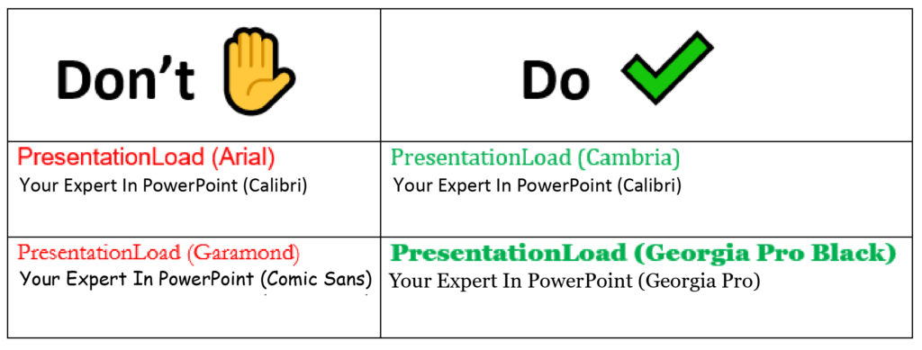
The classic Arial differs only slightly from its successor, Calibri. There are no strong contrasts. These fonts are the right choice to clearly convey your presentation content to your audience.
In contrast to this is the combination of Garamond and Comic Sans. The mix of seriousness and playfulness is too confusing, and they end up negating each other’s intentions.
Cambria and Calibri work: The contrast is created by the serifs in the heading. Otherwise, the shape and degree of sharpness are similar. This is a subtle way to create a balanced font design.
Another winning combination is Georgia Pro Black and Georgia Pro. These two exemplary fonts come from the same typography family. The strong contrast is primarily created by different stroke weights.
Tip: Using too many different fonts in a presentation? Use this trick to correct all your slides in a snap:
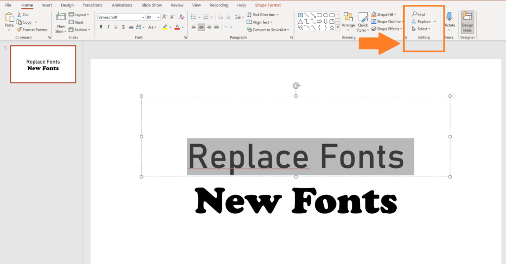
With the Replace Fonts… command, PowerPoint lets you change the font on all your slides. Here’s where you’ll find this function:

Download or embed new fonts
As a designer, you are always looking for new, inexpensive fonts for PowerPoint presentations. There are now many providers on the Internet – some of them free of charge. Here we have compiled a list of reputable providers for you:
- com: some free fonts but most are subject to a fee.
- de: some free fonts but most are subject to a fee.
- google.com: (English language), all fonts are free.
- dafont.com/de: many free fonts organized into categories.
Learn more about embedding fonts in our article “Embed fonts in PowerPoint“.
Tutorial: Add new fonts to PowerPoint
Using fonts that aren’t preset can be problematic. For example, corporate fonts may not display correctly on other computers or clients’ computers. This can lead to unwanted and unattractive results. This problem can be easily solved by simply saving (embedding) the fonts in the presentation.
Important: Due to licensing restrictions, it’s not always possible or permitted to embed all fonts. Normally, a company doesn’t acquire fonts, but only their rights of use. If you have any questions about this, please contact your font provider directly. You can often find information about licensing in the FAQ on their websites.
Embedding fonts in PowerPoint (2010, 2013, 2016, 2019):
- Launch PowerPoint 2010/2013/2016/2019 and open your presentation.
- Click the File tab and then Options.
Select Save in the left panel.
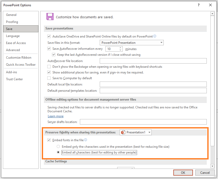
4. Select Embed fonts in the file and click OK.
You can choose to embed only the characters used in the presentation or all the characters in the font. This will increase the file size, but it allows text to be easily added or edited at any time.
Google Fonts: free, modern fonts for your presentation
Another option for designers to find new fonts is offered by Office itself: Google fonts. Microsoft’s huge selection of web fonts can be easily applied to all Office programs. Google fonts can be a major help in giving your PowerPoint presentation a customized, more modern look. They are free and available online which is why they are often referred to as cloud fonts.
Tip: Cloud fonts are only available for PowerPoint 2019 or Office 365. Their big advantage is that you don’t have to embed the fonts; the missing font is downloaded automatically on all computers with Office 365. You can recognize cloud fonts in Office programs by the small cloud icons to the right of them.
You can also find over 1000 font families at fonts.google.com. There are five general categories: Serif, Sans-Serif, Display, Handwriting and Monospace. Sans-serif (French for “without serifs”) fonts are particularly suitable for PowerPoint. They look modern and are the easiest for everyone to read during the presentation.
To make your headings and sub-headers more exciting, try choosing fonts from the Display category. These are especially eye-catching and chic in large font sizes. You can find inspiration in the Popular Pairings section, where you can find favorite combinations for your chosen font.
Important: Be careful not to use too many different fonts. As a rule, stick to a maximum of two. Otherwise, your presentation will quickly look chaotic or copied together.
Download and install additional Google/cloud fonts
- Go to www.fonts.google.com
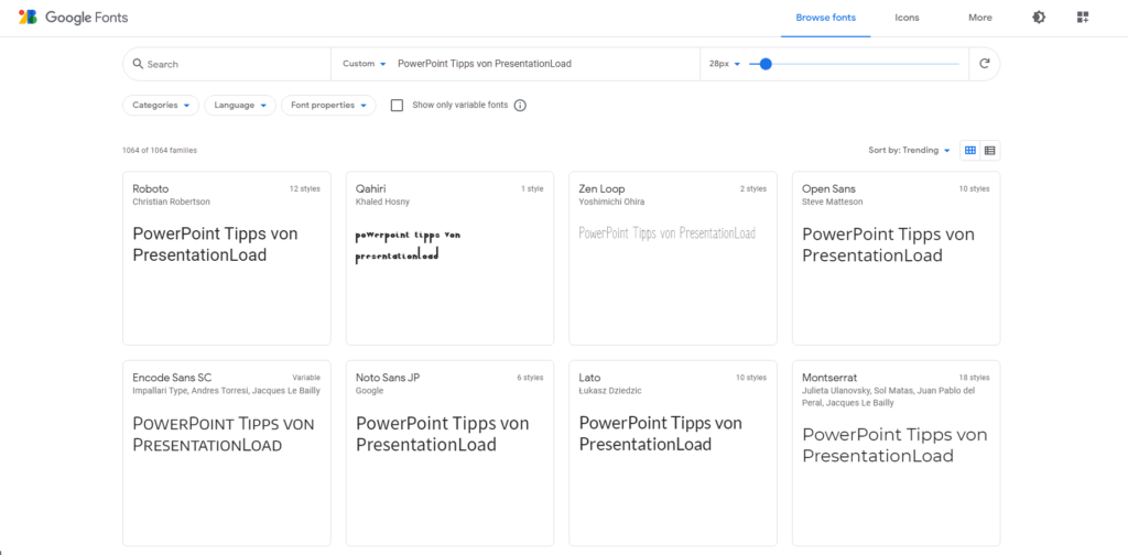
- Search/filter a font. You can even type your own sentence to see how it will look in the fonts displayed below.
- Click on the font you want and then click + Select this style.
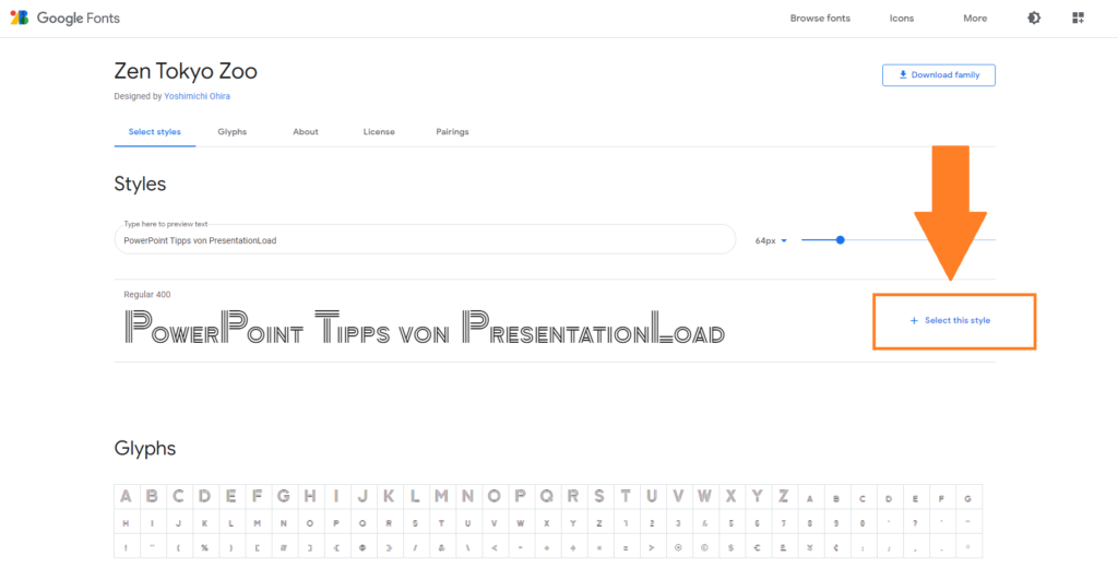
- A side menu, like a shopping cart, will automatically pop up where you can check your selection and then download it via Download all.
- Unzip the ZIP file on your PC. The fonts are TTF files –TrueType fonts that can be scaled without losing quality, just like vector graphics.
- In your Windows search bar, look for Fonts on your PC. Using drag and drop, you can now add the new fonts to the existing ones.
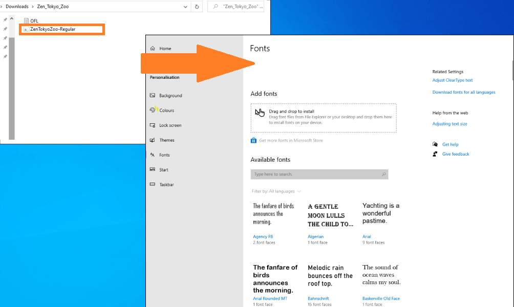
7. The new fonts will now be available when you open any Office 365 program (e.g., PowerPoint).
Make images stand out with the right font
The right combination of font and background image can evoke emotions, regardless of what the text says. Whether used for the beginning of your presentation or to introduce a new topic, images often have a stronger impact than a title alone. Here we show you a few practical examples:

We used Corbel for the first background image. This narrow, straight-lined font creates a modern, businesslike impression. This makes it ideal for financial reports or contemporary corporate presentations.
The font in the middle image is Broadway. As its name suggests, it falls more into the category of entertainment rather than business. This is a wonderful way to introduce topics relating to art, architecture, or culture.
The handwritten, familiar look of the Freestyler Script font on the right is casual. It’s a great way to introduce laid-back or fun topics to your audience.
Text layouts in PowerPoint
How you structure your text is just as important as the font(s) you use. As always, the goal is to present polished and well-structured content without using bullet points.
Everyone is familiar with bullet points in Word or similar Office applications. PowerPoint provides different formats for these bullet points and even provides the option of replacing them with your own symbols, shapes or icons.
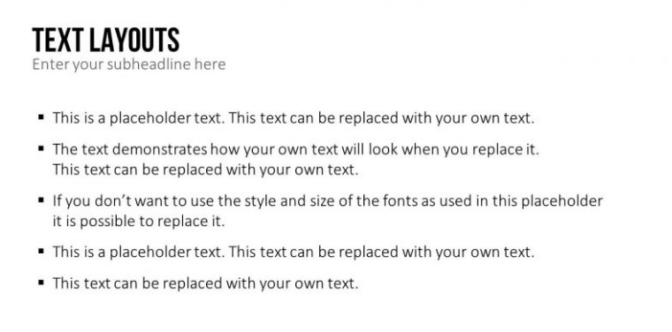
Above is the classic PowerPoint text slide with 5 bullet points. Its disadvantage: The line spacing is all the same which makes the slide less than optimal (font used: Calibri Light 24 pt.).
At PresentationLoad, we prefer to steer clear of bullet points and pay more attention to spacing. Equal line spacing and tabs give the content a much stronger structure. Using our PowerPoint expertise, we’ll show you two examples of how to redesign a simple text.
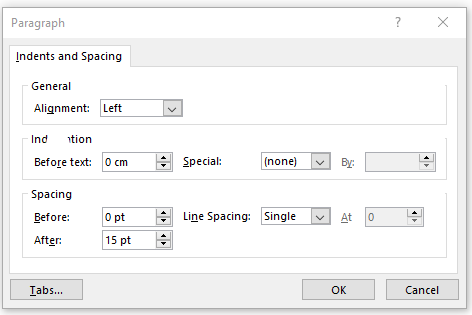
First, we insert spacing after all paragraphs. Here we’ve used spacing of 15pt. This makes the individual spaces between the bullets or lines more clearly visible, which not only makes it easier to read, but also helps create a stringer text layout.
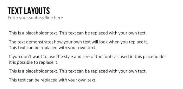
This example clearly shows that you don’t actually need bullet points. The clear separations after line breaks creates five distinct text boxes – even without bullet points.
You can also easily arrange your text into columns, delineating your text even more. To do this, use Add or Remove Columns in the Paragraph group. You can choose One, Two or Three Columns or click More Columns… to customize the number of columns you want. We chose 5 columns with a spacing of 1 cm.
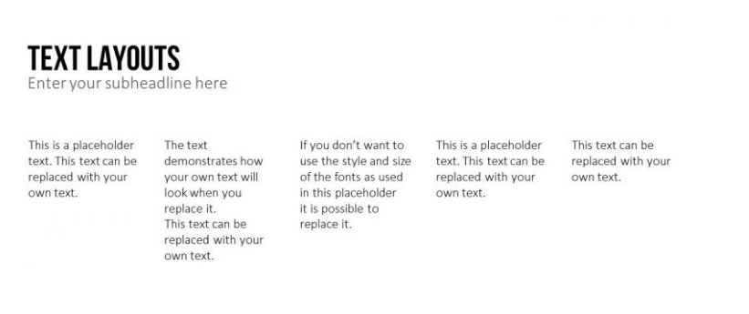
This formatting makes structuring you text quick and easy. Since column formatting causes the text to break sooner, you may need to adjust the font size (we’ve used Calibri Light 18 pt.). In combination with images or icons, this makes it very easy to create attractive PowerPoint slides that quickly transform your text blocks into infographic-style charts.
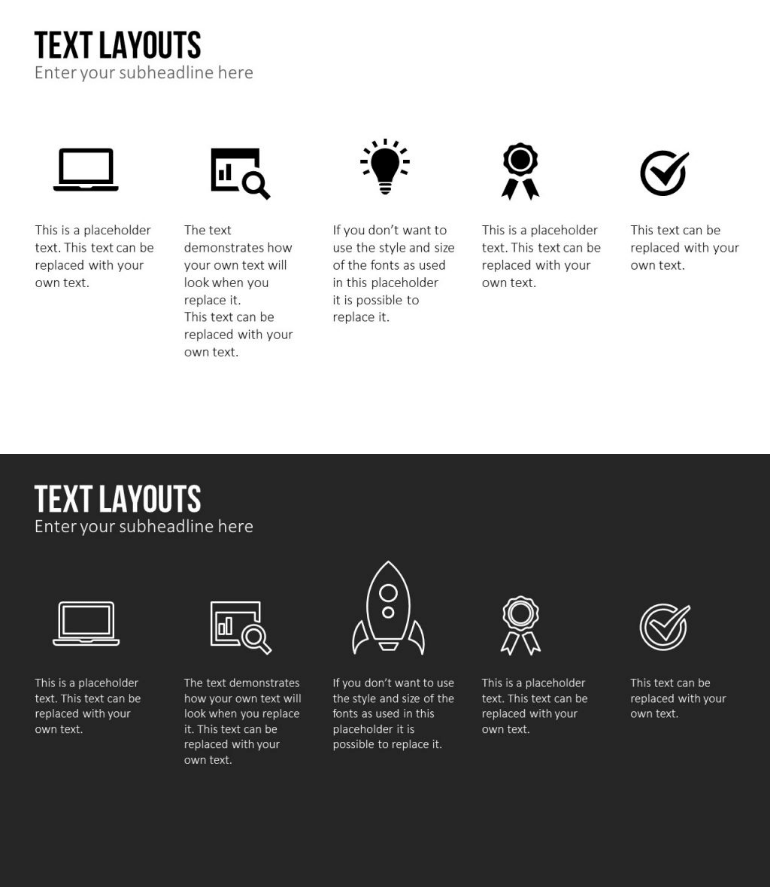
This is all you need to inject your slides with new text design ideas, rearrange the reading direction and most importantly, move away from standard bullet points. If you like this new slide design, check out our templates. They provide a wide variety of vivid text layouts and icons for infographics. Here are some examples:
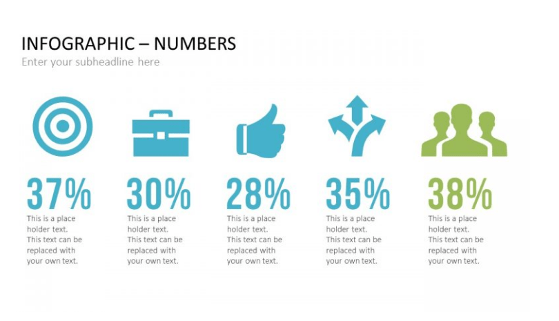
Infographics – Numbers
This template provides ready-to-use, customizable column slides with an appealing text layout to visualize key figures.
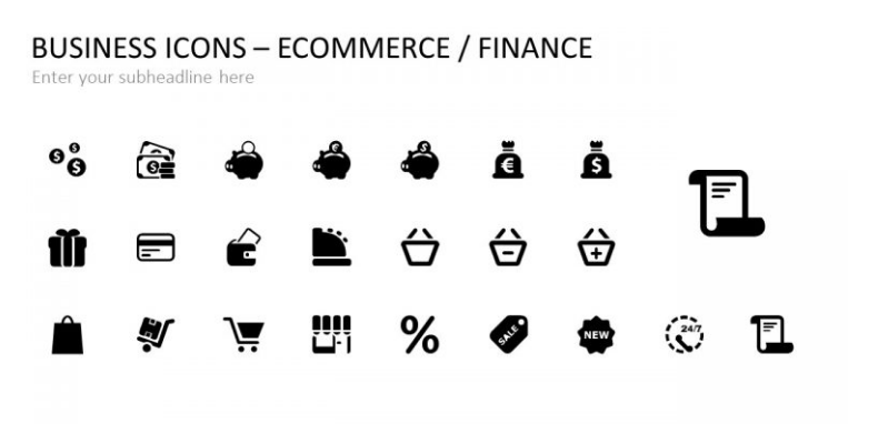
Business Icons
A comprehensive collection of over 400 business icons that you can easily edit, scale or color in PowerPoint. You’ll also find more infographic ideas with icons that you can quickly and easily customize and edit yourself.
Conclusion: The right font is crucial for a successful presentation
Fonts have a long history. Many of today’s popular fonts evolved over several centuries. Every font communicates a specific intention and creates impact. Unusual fonts often manage to arouse more emotions and thoughts through their appearance alone. Even standard fonts rely on their aesthetic to arouse interest.
Headings are most effective when they’re big, bold, dark and have serifs. On the other hand, more practical, sans-serif fonts are ideal for body text. This will not only increase the legibility of your content, but it will also make it much more accessible and persuasive.
Inspiration for new fonts and font combinations is provided by free font portals and Microsoft itself. To help you use Google fonts in your presentation, see the tutorial above. In addition, we’ve also given you tips from professional presentation designers on how to format and structure individual text blocks.
Get creative and use our tips & tricks to become a PowerPoint designer yourself! Or browse the PresentationLoad store for ready-made slide templates and other inspiration.
If you have any further questions about fonts in PowerPoint or indeed about PowerPoint in general, do feel free to email us at [email protected]. We’re always glad to help!
Looking for professionally designed slide templates for your presentation? Take a look around our store! We have a fabulous range of slides for download covering the business topics you need! ►Shop
You might also be interested in the following articles:


