Hotkeys and Tips for Navigating Through Your PowerPoint Presentation – Part 2
These issues were addressed in Part 1:
Part 1 – From the Start of the Presentation to the Helpful Tools
- Shortcuts to use of before and during the presentation
- Accessing Slide Show Help with the F1 key
- Hiding the dialog menu and context menu
- Switching programs during the presentation
- Working with hyperlinks
- Inserting action buttons
In this post:
Part 2 – Setting Up Your Own Navigation Toolbar and Pause Slide
- Putting together your own navigation toolbars
- Practical use of the slide master in the navigation toolbar
- Showing a “pause image” at all times
Upcoming Posts:
Part 3 – Orientation – for the Speakers and the Audience
- Installing chapter slides for audience orientation
- “Keeping an eye” on your agenda
- Working with two screens
Part 4 – Presenter View and the Difference from PowerPoint 2013/16
- Using Presenter View of PPT 2013/16
- What is new or different in the newer versions
- More tips & tricks
7.) Putting together your own navigation toolbars
In the first part of this blog series, you learned how to deal with buttons and hyperlinks. Now, let’s create complete custom navigation toolbars.
Depending on the action or switch you want to perform with other applications, you should plan ahead for which buttons you’ll need before constructing anything in PowerPoint. Doing this is will determine the amount (content) and size of the buttons. At the same time, this begs the question: where and how should the buttons be arranged?
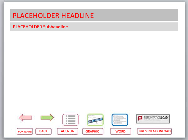
You will need the following functions:
- a slide going back (in arrow form)
- a slide going forward (also in arrow form)
- a link to the 2nd slide in the presentation (i.e. the agenda)
- a link to a slide with certain graphics
- a link to a Word document
- a link to the website (PresentationLoad)
First construct all the forms with the corresponding links – and next the first strategic decisions are already required: Now, do you use exclusively graphics, only text or a mixture of both in the presentation? Should the buttons all be the same size? This question is generally difficult to answer, since it deals with different content.
A.) The forms of two arrows serve as buttons for forward and back links.
B.) Here the gray icons were designed from individual shapes and grouped with the frame as an image.
C.) A hard copy of the original graphic (to which you want access later) was scaled down and then also grouped with the frame.
D.) Similarly here, a hard copy of the Word text was used.
E.) In this example, a graphic segment of the linked website was used.
Questions about colors, fill-ins, and the design measures must also be coordinated.
Text Buttons are recommended if third parties (people not involved in creating the presentation) use the presentation. This is so the label of the button can directly indicate to the hyperlink.
Next, you need to decide where and in which form your navigation menu should be on the slide. Under certain circumstances, the final arrangement and size of the buttons are already in place.
Once you have decided on the final form, group all the elements. Then you can move, copy and edit this group much easier.
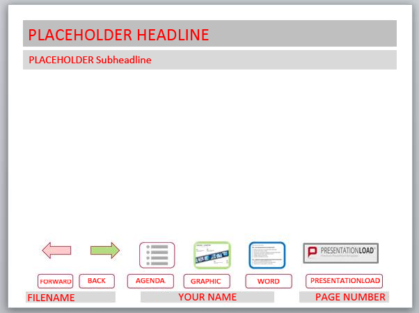
In the following example there is enough space to place the buttons in a row at the bottom of the slide. To illustrate the visual effect, both the text and the icon buttons are inserted.
However, if you have already set other placeholders at the bottom such as file name, name of the lecturer, and page number, then the space is tight. This applies particularly if there are more graphical elements of the corporate design, a company logo, etc. By using a navigation menu, it ultimately reduces space and makes it available for the actual content of the slide.
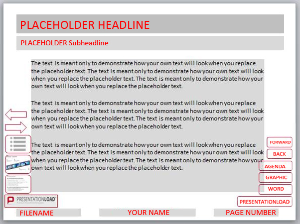
Of course, the lateral edges are technically available, but first, there is usually no room on the sides available and secondly, it would confuse the viewer if the navigation elements were placed there, as the slide content would be in the middle. Rectangles and other cross-formats are particularly unsuitable as this could possibly be colliding with content elements.
To solve the problem, it is usually best if you significantly minimize designs, abbreviate texts and simplify graphics.
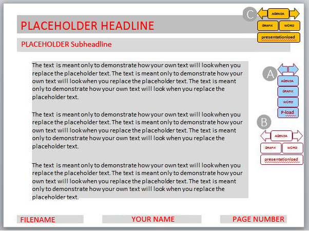
A.) In addition, you can set the buttons very close to each other, and possibly use color fill-ins so they can be seen more clearly.
B.) Sometimes it is worth it to arrange the buttons differently.
C.) Another option is to place your navigation menu in the upper area. Since these areas are often designed with intense color, you should make sure the buttons are clearly labeled.
To work around this problem of space, there is a good solution by means of a trigger effect.
A.) You should place your navigation menu outside the slide, for example to the right. Then, provide this group with an animation path to the left.
B.) Place a rectangle in a corner of the slide. Then select the animation path, by clicking directly on the dotted line.
C.) Now open the Animation pane in the menu bar. Select >Trigger >On Click of >Rectangle. This means that the animation will only be executed when you click on the rectangle in the corner – so only when needed. Then select the rectangle and select >No frame and >100% transparency. Then the rectangle is not visible. If you have created the rectangle large enough, you can easily click on the correct area and it will appear the navigation menu. You can then select one of the buttons included with the hyperlinks.
This trick can be applied very well in two ways: on the one hand, there are situations in which you superimpose a graphic or a photo, but you don’t want to see it in the displayed version. It can be displayed in the manner described above and then with another hidden button disappear again.
On the other hand, you, as a speaker, do not always know exactly which outputs should be presented to viewers in a lecture. When presenting annual figures, it is possible that will be asked for the numbers of past years. You should prepare yourself for this possibility by (specify if necessary) leaving some buttons (as a group) with links to the results of recent years, instead of the navigation menu (e.g. in various Excel spreadsheets).
8.) Effective use of the Slide Master in the Navigation Menu
In point 7.), the navigation menus described are intended primarily for the purpose that they are placed on each slide.
It would be very time-consuming if you had to put your navigation menu on each slide individually. Instead, there is this interesting solution: Place your group with the hyperlinks and the “invisible” rectangle for the trigger effect on the slide master, because then the functions are continuously activated!
You should insert an x-arbitrary shape in the slide master in order for this variant to connect something only once, then provide it with a link and play through the whole thing in presentation mode several times.
However, there are some complications you need to consider that can affect the functioning of the hyperlinks:
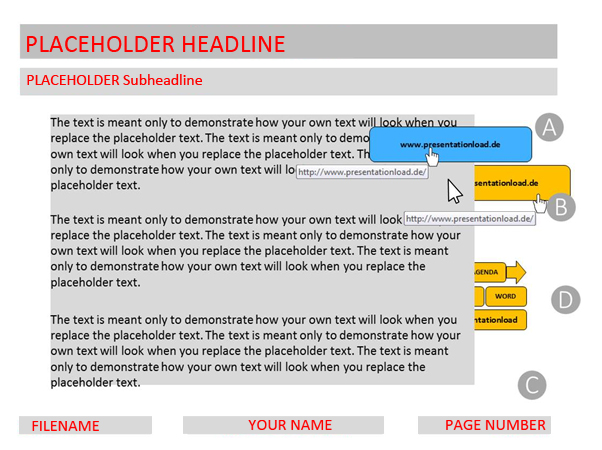
A.) The blue design contains a link to the relevant website. This design is ON the slide and when you move the mouse pointer over the entire link in presentation mode you can see the link address. When you click on the link a connection is made.
B.) The colors of the group of the Navigation Menu have only been changed on the Slide Master. It is now partially below the placeholder for the content text (shown in gray). When you move the cursor back and forth, you will see now that the cursor changes: on the left side of the design, you only see the normal arrow but on the right side, however, the mouse pointer turns into a hand. This means that if the link is covered on the master slide (here colored for clarity) from one placeholder and / or other element on the slide, then the action cannot be initiated!
C.) Here the hidden rectangle is not visible on the master slide. If you click the mouse in this area, the familiar navigation menu appears to the right.
D.) Now the navigation menu appears by an animation path and you can use the established links set up that were set up there. BUT only the freely accessible link designs can be activated. You might have to adapt and shorten the length of the animation path, so that all forms are freely available.
Warning: It may turn out as a disadvantage that your inserted links to navigation are now on all slides that are connected to the corresponding master. If so, it is advisable to generate a new master here, and then you can explicitly apply it to the slides in which the navigation menu will be used.
9) Show a “pause image” at all times
This technique described above can be used in varying ways. A hidden button can also naturally lead to a different application. You just have to remember as a speaker, which “invisible” button triggers what on which slide.
For example, it will be apparent in longer series of lectures or trainings that a spontaneous short break is desired. In this case, it is practical and visually appealing, if you can easily and quickly import a pause screen (which, for example, can be animated in the form of a clock).
First, create your pause screen. Then save this design under an appropriate name. When dealing with multiple slides or animations that should be repeated, save it as a PowerPoint slide show (.ppsx file format).
Then create an “invisible” design on the master slide, as you have learned and link the design with the file. This is so you can always start the pause screen, no matter where you currently are in the presentation. Caution: Always be sure that you place the invisible design to the correct slide in the slide master.
We hope you enjoy trying it out!
Check out Part 3 – Hotkeys and Tips for Navigating Through Your PowerPoint Presentation


