Presentation Flow: Leading Your Audience’s Eye Through Effective Design
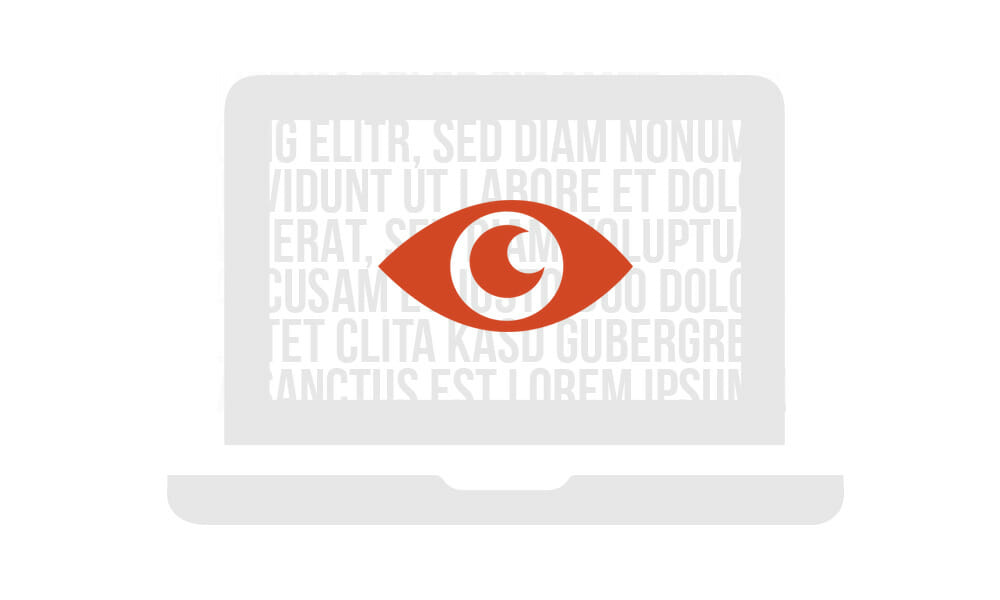
How does an audience’s reading behavior affect your presentation? Being aware of what attracts an audience’s eye allows you to optimize your presentation’s layout and ensures your slides have maximum impact.
Great content is the first step to grabbing your audience’s attention. But you can’t expect an audience to listen to, and most importantly, understand your message while reading text-heavy slides. The secret to a successful presentation lies in its flow. By using just a few simple design tips, you can effectively highlight and support your content, and use your audience’s natural reading behavior to your advantage.
Here are a few design principles to keep in mind.
- Start left to right, top to bottom
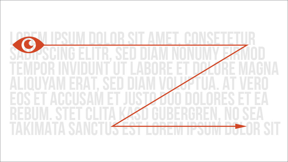
English is read from left to right, and from top to bottom. So it makes sense that your audience will notice elements in the top-left corner of your slide first. Place all titles and important graphics in the upper half of your slide or if the slide is divided vertically, on the left.
- Use eye-catching slide titles

Large and bold titles attract attention. The clearer they are, the more likely your audience will read them first.
- Less is more
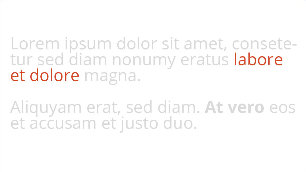
No one wants to read through paragraphs of text in a presentation. Most audiences just scan for key information. So if your slide is text heavy, you know important details will be overlooked. Keep the text on each slide to a minimum and highlight keywords in bold or with a contrasting color to attract attention.
- Work with visual weight
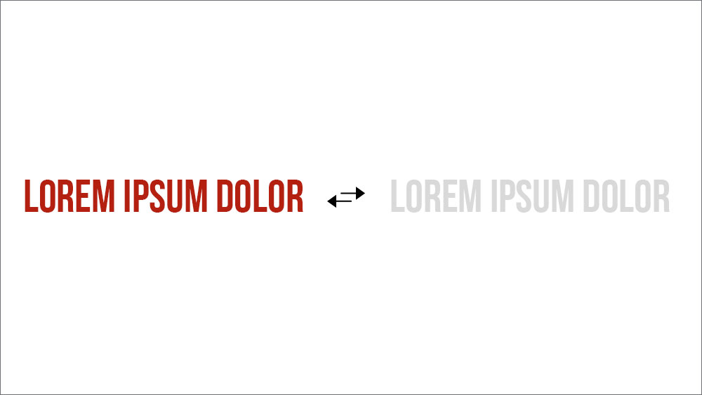
Layout aside, some elements have more visual weight than others and naturally command attention. For example, larger fonts always stand out from smaller fonts, and dark red is more distinct than light grey. Elements with a heavier visual weight will always be noticed first, no matter where they are on a slide. When it comes to choosing between visual weight and reading direction, always consider what best conveys your content. You could even combine both for maximum impact.
- Incorporate an eye-catcher
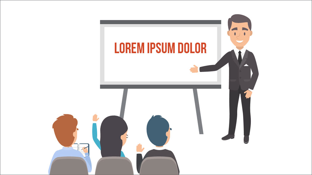
Images with people can be distracting. An audience will tend to focus on where the person in the image is looking or pointing. So why not use that to your advantage? Placing key content directly in the sight line of the person in your image will guarantee your audience is focusing on what’s important.
- Use templates
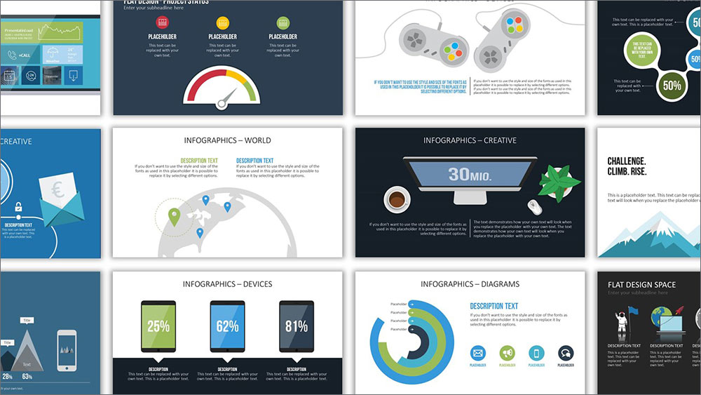
Graphics and templates can also guide an audience’s attention. The viewer automatically tracks well-known images, such as a road, or a semicircle in the form of a speedometer. These kinds of graphics help create a polished and creative presentation. You’ll find a large selection of professional graphics in our design templates category.
Once your content and ideas are set, take some time to think about the visual design of your slides. It’s time to find your presentation’s flow.
