The Right Way to Use Pie Charts in PowerPoint
Pie charts are a popular tool to present parts of a whole. They help visualize data in a clear and easy-to-understand way. However, like all other diagram types, they need to be used correctly. Pie charts are often used for the wrong data sets. When used in the right context, pie charts are effective and impactful.
Three Questions Before Using Pie Charts
The three questions you should ask yourself before creating a pie chart are:
- Is this the right type of chart to use here?
- How can I best design the chart?
- Are there better alternatives?

There are many reasons we use pie charts: out of habit, because we want to represent parts of a whole, because circles are aesthetically pleasing and last but not least, because we know of no better alternative.
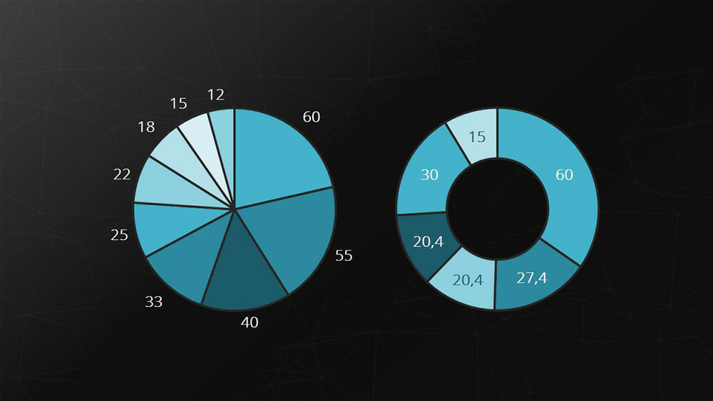
Pie charts are the perfect diagram to show parts of a whole that total 100%. The individual values shown should strongly contrast each other and there shouldn’t be more than five categories in one chart.
Drawbacks of Pie Charts
There are some disadvantages to pie charts that need to be considered:
- Small values are often difficult to distinguish in pie charts and just don’t look good when combined with comparatively large labeling.
- With several similar or equally large values, the difference between them virtually disappears. In such cases, pie charts are not the right choice.

Alternatives: Bar Charts & Column Charts
Two well-known alternatives that are just as effective at representing proportions are bar charts and column charts. Bar charts are particularly useful for visualizing ranks and organizing categories by size. Column charts are great for distributions, such as election results. For these types of data sets, bar and column charts are your best choice.

Pie charts are often, but not always, the right type of chart to use. To maximize impact, consider your data set and what type of chart will work best. And don’t be afraid to use new types of charts and diagrams! You’ll find plenty of inspiration in the PowerPoint Diagrams category in our shop.
Share this post


-

Design Thinking: Problem Solving with a Difference
-
Why Corporate Mission Statements Are So Important
-
7 Tips & Learnings from the Apple Keynote


-
Design Thinking: Problem Solving with a Difference
-
Why Corporate Mission Statements Are So Important
-
7 Tips & Learnings from the Apple Keynote