The Right Text Alignment on PowerPoint Slides: This way Your Text is Easy to Read!
Every PowerPoint presentation includes text. While it is generally advised not to overload your slides with text, there are situations where you may need to project text that spans multiple lines. Today, we will show you how to align this text effectively to present it clearly.
Why Text Alignment is Crucial for PowerPoint Presentations
Text alignment plays a significant role in PowerPoint presentations as it directly affects the readability and visual aesthetics of the content being presented. The way text is aligned on slides can influence how the audience perceives and understands the text.
Conscious and strategic text alignment allows for presenting the text in a clear and visually appealing manner, thus enhancing the effectiveness of the message being conveyed.
Why is conscious text alignment important?
Conscious text alignment is important because it helps improve the readability of the presentation and enhances its visual impact. By choosing the appropriate text alignment, you ensure that the text is well-structured, easy to read, and visually pleasing.
Conscious text alignment also supports visual hierarchy and emphasis by directing attention to important information. On the other hand, careless or inconsistent text alignment can lead to confusion and hinder readability.
Text Alignment Options in PowerPoint
Microsoft PowerPoint offers various text alignment options to position the text on slides. Each alignment option has its specific characteristics and impacts on the visual representation of the text.
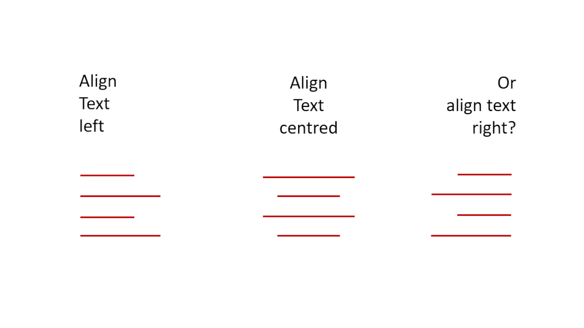
- Left Alignment
This text alignment is the most commonly used and provides a natural reading order from left to right.
- Right Alignment
This variant creates an unusual visual flow and can be used to emphasize text.
- Center Alignment
By selecting this option, you create a symmetrical arrangement that can be effective for short texts or headings.
- Justified Alignment
This text alignment, where the text is aligned both left and right, can create a clean and professional look, but should be applied with caution to avoid uneven spacing between words.
Which text alignment is right for your presentation?
There is no one-size-fits-all answer to this question. We will now present you with the different options along with their pros and cons.
In general, you should keep your target audience in mind. Where and in front of whom will you be delivering the presentation? Cultural backgrounds often play a role in choosing the right text alignment because in Western languages read from left to right, most presentations are left-aligned.
In languages with right-to-left script such as Arabic or Hebrew, right alignment should be used to maintain the natural reading direction.
Option #1: Left Alignment

Pros: Left alignment is the most common and often used as it allows for a natural reading order from left to right. This makes it easier for the audience to read and comprehend the content. The text has a clear edge on the left side, making it easy to grasp and read. The clear edge supports quick comprehension of the text.
Cons: Harder to read for languages that do not read from left to right.Option #2: Right Alignment

Pros: Right alignment, on the other hand, can be used to highlight specific text elements or create visual interest. It creates an unusual visual flow and can be creatively used in designing titles or quotes
Cons: Harder to read for Western languages as it interrupts the natural left-to-right reading flow.
Option #3: Center Alignment

Pros: Center alignment is particularly suitable for short text elements or headings. It creates a symmetrical arrangement, placing the text in the center of the slide. This can create an aesthetically pleasing display and draw the audience’s attention.
Cons: The text “flutters” on the left and right. There is no clear edge. This can make it difficult for our eyes to read. For longer text passages, center alignment may not be optimal as it can hinder readability.
Option #4: Justified Alignment
This variant is very rarely used in PoiwerPoint presentations and is more suitable for longer text in essays or similar.
Pros: Justified alignment, where the text is aligned both left and right, can create a clean and professional look. The equal spacing between words creates a neat appearance.
Cons: However, caution is advised as justified alignment can sometimes lead to uneven word spacing, which impairs readability. It is advisable to use justified alignment judiciously and carefully review the text to avoid unwanted gaps or overlaps.
Additional factors that can influence text alignment
- Emphasis and hierarchy through text alignment
Text alignment plays an important role in emphasizing and creating visual hierarchy in presentations. By selecting the text alignment, specific information or elements can be highlighted and visually emphasized.
For example, right alignment can be used for quotes or important keywords to give them greater significance. Smart use of text alignment allows for controlling the visual hierarchy of the presentation and better highlighting important information.
- Combination of text alignment and visual elements
Text alignment can be used in conjunction with other visual elements on the slides to create an appealing and balanced presentation. The alignment of text can harmonize with graphics, images, or charts and create a visual unity.
For example, the alignment of bullet points or text blocks can be aligned with the visual elements on the slide to create a coherent and aesthetically pleasing presentation. The conscious combination of text alignment and visual elements allows for designing a visually appealing presentation that effectively conveys the message.
Text alignment on different slides
It is not necessary to consistently use the same text alignment throughout your presentation. Since presentations consist of various slides with different purposes (title slide, slide with visual content, etc.), it may be useful to mix different styles.
- Text alignment on title slides and headings
For title slides and headings, it is often effective to use a central alignment to visually highlight the text and capture the audience’s attention. This helps convey the message clearly and concisely. Alternatively, left alignment can be used to maintain a natural reading direction and support the flow of the text.
- Text alignment in bullet lists and text blocks
For bullet lists and text blocks, left alignment is often suitable as it allows for a clear structure and easy readability of flowing text. The alignment can help visually distinguish individual elements in the list or text block and improve readability.
It is important to maintain consistent text alignment within a list or text block to ensure consistency and visual harmony.
- Text alignment in diagrams and tables
For diagrams and tables, the text alignment should be adapted to the visual elements. For example, the text within a diagram or table can be centrally or left-aligned to establish a clear connection between the data and its description. The alignment should aim to support the reading flow and understandability of the presented information.
What else to consider
To create a visually appealing presentation, it is important to maintain a consistent and uniform text alignment throughout (except for titles, diagrams, etc.). By consistently aligning the text on all slides, you create visual continuity that allows the audience to have clear orientation. Consistency in text alignment gives the presentation a professional appearance and promotes readability and visual aesthetics.
Additionally, keep in mind that text readability is influenced not only by text alignment but also by line spacing and font size. It is important to choose an adequate line spacing to make the text easily readable. The font size should be appropriate to ensure legibility from a distance. Carefully adjusting the text alignment, line spacing, and font size ensures optimal readability of the presentation. You can read more about the appropriate fonts for your presentation in the article “Fonts in PowerPoint.”
Furthermore, when choosing the text alignment, always consider your target audience. A formal presentation style may require a conservative and traditional text alignment, while a creative and modern style allows for more experimentation in alignment.
Conclusion: Skillfully determine the right text alignment
When preparing your next presentation, take a closer look at the text alignment you intend to use. Is it really the right choice for your purposes, or should you consider changing it? Follow our guidelines in the article and find the appropriate text alignment to impress your audience!
If you have any questions about the article, feel free to email us at [email protected]. We’re here to help!
If you’re looking for visually supportive and professionally designed slide templates, please visit our shop. We have numerous slides available for download on a wide range of (business) topics. Check it out today! ► Shop
You may also be interested in these articles:
Share this post


-

Design Thinking: Problem Solving with a Difference
-
Why Corporate Mission Statements Are So Important
-
7 Tips & Learnings from the Apple Keynote


-
Design Thinking: Problem Solving with a Difference
-
Why Corporate Mission Statements Are So Important
-
7 Tips & Learnings from the Apple Keynote