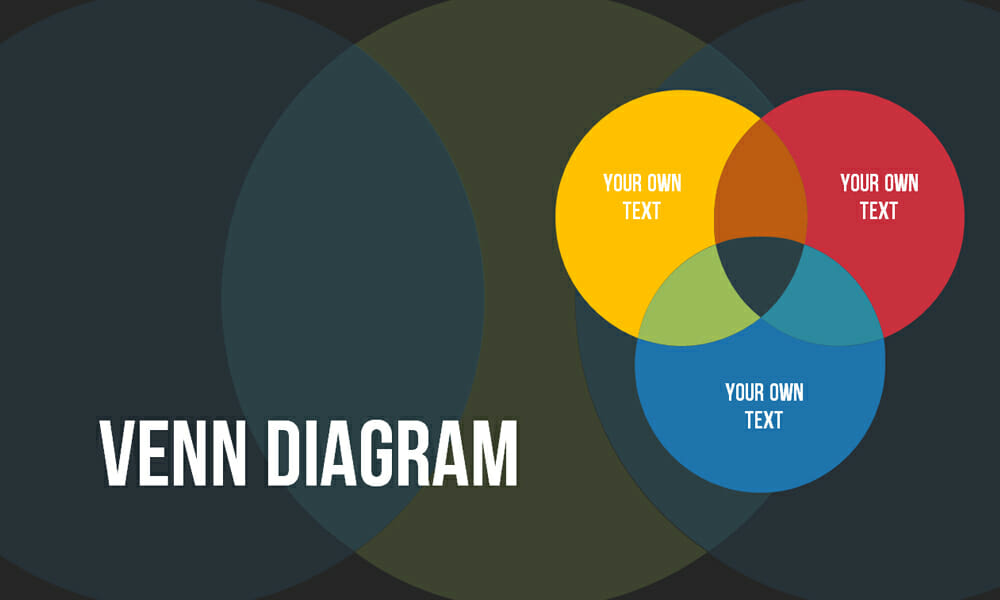
Create Venn Diagrams in PowerPoint: 4 Types
Venn diagrams are quantity charts and are increasingly used in presentations. Pictures are absorbed better and faster by the audience than text. This makes diagrams in general and Venn diagrams in particular attractive to presenters.
In this post, we’d like to show you how to create Venn diagrams and properly showcase them in your presentation.
The History of the Venn Diagram
The Venn diagram is named after the British logician John Venn. He first mentioned this type of diagram in 1880 in his article, On the Diagrammatic and Mechanical Representation of Propositions and Reasonings.
But the origins of this type of diagram go back much further. Ramon Llull, a philosopher and logician, used a similar type of diagram around the 13th century. The mathematician and philosopher Gottfried Wilhelm von Leibnitz also drew a similar form of diagram in the late 17th century.
Swiss mathematician Leonard Euler’s Euler diagram is considered by most to be the predecessor of the Venn diagram. In fact, John Venn originally called his diagram Euler’s circles. The Venn diagram got its name from the American philosopher Clarence Irving Lewis in his 1918 book, A Survey of Symbolic Logic.
The Venn diagram has continued to evolve over the last 60 years. For example, the diagram’s shapes were simplified to make it easier to visualize.
What is a Venn diagram and what is it used for?
Venn diagrams are simple illustrations of the relationship between two sets of things. Circles that overlap have something in common. Circles that don’t overlap don’t share a trait.
Venn diagrams, also called logic diagrams, are often used in mathematics, logic, statistics, computer science, linguistics and business. You may have already seen or used a Venn diagram in a math lesson in school.
The purpose of these diagrams is to illustrate how elements in a particular field relate to each other. Venn diagrams are an excellent way to visualize data and facts clearly and effectively. This is what makes a Venn diagram in PowerPoint are so effective.
The wide range of set charts in PowerPoint can be used in a variety of ways, especially because Venn diagrams are also suitable for displaying content that is not based on numbers. Thus, all kinds of relationships and overlaps in several areas can be presented graphically with the help of Venn diagrams.
What are the benefits of using a Venn diagram in PowerPoint?
- It clearly visualizes data
- It illustrates relationships and connections between two or more groups
- It’s uncomplicated and easy to create
- It adds visual appeal to a presentation
What does a Venn diagram represent?
Venn diagrams consist of two or more circles that overlap to show commonalities:
- Set: A group that has a common theme.

- Intersection: Also called overlap, represents the commonalities between the two sets. In this diagram, the dark blue area = the intersection.

- Reuleaux triangle: The shape created by three circles intersecting (dark blue in this case).

How to create a Venn diagram in PowerPoint
PowerPoint offers several versions of the Venn diagram. Here are all your options.
We’ve used Microsoft’s PowerPoint SmartArt graphics for all Venn diagrams:
- Go to Insert > SmartArt.

2. In the new window, select Relationship on the left side.

3. Click on the Venn diagram layout you would like to use to insert it on your slide.

4. Customize the diagram:
- Delete a shape from the diagram: Right-click on the shape you want to remove. Select Cut from the drop-down menu.
- Add a shape to the diagram: Click on the diagram to open the SmartArt Design tab. Select Add Shape. You now have two options: Add Shape After inserts the new circle after the selected circle. Add Shape Before will insert a new circle before the selected circle.

- Add text: Click on inside the circle and you can start writing. Or use the Text Pane to the left.
- Add text in the intersection: Go to Insert > Text Box. Drag it to any place within the Venn diagram and you can insert your text.

Which Venn diagram forms are there?
The Standard Venn Diagram

- Very versatile and frequently used Venn diagram
- Good for illustrating commonalities and relationships between responsibilities, departments, etc.
The Linear Venn Diagram

- Venn diagram that works particularly well with overlaps and sequences
- Good for displaying elements that may not be directly connected or for segments of a process
Stacked Venn Diagram

- Illustrates overlaps and growth
- Good for comparing quantities
Radial Venn Diagram

- Can be used to create mind maps, which show relationships among pieces of the whole
- Good for collecting ideas and overlapping areas of interest
- Good for visualizing company departments and project areas
Designing Venn diagrams in an appealing way
Idea #1: Venn diagram with animation
It’s no secret that interactive elements increase the audience’s attention. Therefore, even with charts, use the possibilities PowerPoint offers to create animations and transitions.
For example, you can use animations to gradually fade in your Venn diagrams or highlight the different parts of the diagram. This can be especially helpful when you use your presentation to explain connections and relationships between the quantities presented in a step-by-step manner.
To apply animations to Venn diagrams in PowerPoint, first select the element you want, such as a single circle or the label of a quantity. Then navigate to the Animations tab in the main menu. Here you will find a variety of animation options such as “Appear”, “Highlight” or “Zoom”. You can also create custom animations to specify a particular order in which the elements of the Venn diagram should be displayed or highlighted.
Be careful not to overload the animations to keep your presentation clear and professional.
For more information about animations in PowerPoint, see the article “PowerPoint animations“.
Idea #2: Proper color scheme and typography
When designing the color scheme, it is important to choose harmonious and legible color combinations that draw focus to the information without overwhelming the viewer. Make sure that the colors used provide enough contrast to ensure good readability.
The typography should be clear, simple and easy to read so that viewers can easily grasp the captions and text features.
Idea #3: Display complex data in a simplified way
If you design your Venn diagrams to be too complex, you run the risk of losing the audience’s attention and not getting the content across properly. It’s critical that you project data as simply as possible.
Focus on the essential elements of the Venn diagram and remove unnecessary details. The color scheme mentioned in the previous subchapter can help. The following strategies can also help to simplify your data:
- Prioritization of information: Identify the most important aspects of the data and put them front and center. Reduce secondary or less relevant information to focus on what is most important.
- Clustering of similar elements: If possible, group similar items or categories together to reduce the number of quantities shown and provide a clearer presentation.
- Use legends: Instead of placing all the information directly in the Venn diagram, you can use a legend to provide additional information or explanations without cluttering the diagram itself.
- Customizing the display: experiment with a variety of display forms such as different shapes, line thicknesses or shading to increase the clarity and comprehensibility of the diagram.
- Step-by-step presentation: Instead of presenting all the information at once, you can present your data step by step by using animations or multiple slides. This allows you to show complex relationships gradually and not overwhelm viewers.
Conclusion: Visualize relationships more effectively with Venn diagrams in PowerPoint
Venn diagrams clearly display data and relationships and visually enhance presentations. Their versatility and clarity make them a popular choice in presentations. On top of that, they are straightforward and easy to create. Follow our instructions and take advantage of the many benefits of Venn diagrams!
Not interested in creating your own Venn diagram and prefer to use professional, ready-made templates? Then take a look at our selection. Our Venn diagram templates are always up-to-date and created by our designers for you.


Are you looking for visually supportive and professionally designed slide templates? Feel free to have a look around our store. Here we have numerous slides prepared for you to download on a wide variety of (business) topics. Take a look today! ► To the store
Other articles that might be interesting for you:
Share this post


-

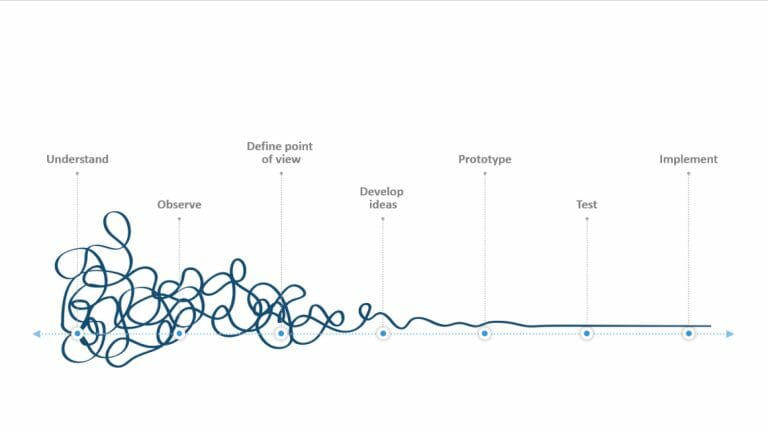
Design Thinking: Problem Solving with a Difference
-
Why Corporate Mission Statements Are So Important
-
7 Tips & Learnings from the Apple Keynote


-
Design Thinking: Problem Solving with a Difference
-
Why Corporate Mission Statements Are So Important
-
7 Tips & Learnings from the Apple Keynote