
How to Create an Outstanding Report Presentation!
A report presentation is a daily necessity for most companies. Employees are constantly working on compiling data and facts about their company and department and presenting them in PowerPoint presentations. But often, the presentation design fails to impress.
In this article, you’ll learn how to visualize hard data into an appealing and engaging report presentation for your audience.
What exactly is a report?
A business report is a formal document that communicates corporate information clearly and concisely.
In a report presentation, a company presents data, facts and information, quarterly balance sheets, turnover, HR developments, and so on.
Why report presentations are so important
Report presentations are essential to the success of your business. Why? It’s simple.
Report presentations provide a coherent overview of your company’s performance: What is the current status quo? Which strategic decisions need to be made in the future? How are resources being allocated?
This clear presentation forms the basis for future fact-based decisions. This means it must present facts transparently and answer any business-related questions.
What does a good report presentation look like?
A report presentation has to be clear and concise – after all, you want your audience to understand what you’re saying.
Reporting on data is often very dry. You need to present it in the most visually interesting way possible. An attractive report design will help your audience understand your key messages immediately, without having to delve into specific corporate figures. Keep reading for tips on how to do this.
How to create an engaging report presentation: 5 tips
Report presentations are usually time-limited, so focus on the essential information. The key is to communicate facts clearly and concisely.
Give your information visual interest. Microsoft PowerPoint offers numerous possibilities for enhancing the look of your presentation. Below we have compiled 5 tips for you on how to create an appealing report.
Tip 1: Prepare properly

Preparation lays the foundation for a successful report presentation. Think carefully about how you want to present specific facts and data. Know what you want to say and what your goals are – that’s key for a great report presentation layout. Each slide must have a specific purpose. Only include data that is essential to convey your message.
Give your slides variety but don’t overload them with information or graphics. Less is often more. Try out the unique features of PowerPoint and see which option best suits your presentation.
Focus on the most important key figures and avoid unnecessary details. A good report presentation should make your key statements understandable without your audience having to delve deeper into the company’s key figures.
For 11 helpful tips on preparing your presentations, check out our post, Preparing a PowerPoint Presentation.
Tip 2: Chose the right charts and diagrams
Charts and diagrams are the best way to visualize figures and data. Not only are they visually appealing, but they also summarize your statements in a way that is easy to understand.
PowerPoint offers a wide range of charts and diagrams. You can choose from pie charts, bar charts and area charts, as well as other customizable diagram options. We’ve summarized an overview of the best diagram styles and when to use them in our article, 10 Chart Types: Which One Is Right for My Data?
Some chart types are more suited to specific data. For example, a pie chart is a terrific way to show gender distribution in your company. Bar or column charts can be used to visualize sales, balance sheets and profits.
If you want to illustrate aspects that have happened over a longer period of time, area charts, line charts and of course timelines are ideal.
Feel free to combine several chart types. Let your creativity run free. You can also add icons to your diagrams. The possibilities are endless! Just keep it simple and don’t overload your slides. You can find professionally designed icons in our shop. Take a look at these:
Once you’ve found the right type of chart or diagram, it’s time to highlight the most vital information in it. This helps your audience understand your key messages and quickly identify the most important aspects of your report presentation. If you need to, you can further explain these aspects as you go along.
You’ll find professionally designed slide templates for various charts in our shop. For example, this template:

Tip 3: Reuse layouts
Certain topics often reappear in report presentations. A good example of this is quarterly figures or annual financial statements. With these kinds of topics, it makes sense to the invest time in creating an optimal layout that you can reuse.
If you want to compare quarterly figures or annual financial statements, using the same layout makes any differences clear and obvious to your audience.
You can find out how to create your own layouts and other tips & tricks here.
Tip 4: Other design elements
You can also use additional design elements to enhance your report presentation. There are unlimited, creative options to choose from. Think carefully about which elements will visually support your statements.
Try to include transparent images. These are more attractive than normal images and set visual accents when combined with text or graphics. Transparent images are also effective as customized backgrounds, like on title slides. We’ve put together more information on transparent images for you here.
Another design idea is icons. These small images help to break up blocks of text and reduce presentation content to a bare minimum. The simple messages behind icons are universally understood and save space on slides. More information can be found here.
Tip 5: Practice, practice, practice
Ideally, a report presentation should need little accompanying information – your slides should speak for themselves. But that doesn’t mean you don’t need to practice. Especially with diagrams, extra information can further support the infographics. Put particular focus on getting your key messages across.
Think about any questions that your audience may have. Even when your report presentation covers only key content, it’s still important to know and convey more in-depth background information on data, facts and figures in case of follow-up questions.
Of course, there’s so much more that goes into a convincing presentation. Here are some articles with helpful tips:
- 16 Ways to Kick-Start Your Presentation
- Body Language in PPT Presentations: 8 Tips & Tricks
- Rhetoric Skills: How to Speak and Present Effectively
- Presentation Hack: Always Focus on Your Audience’s Needs
- Because First Impressions Aren’t Everything: 20 Tips and Ideas to End Your Presentation in Style
You can find more helpful articles in our blog. ► To the blog
Create expert report presentations
Report presentations are a common part of day-to-day business. With their clear graphic elements, reports communicate unambiguous information that is essential for a company’s success.
No doubt your next report presentation is already in your business calendar. Take our tips to heart and try them in your next report.
Do you have questions about report presentations or general questions about PowerPoint? Feel free to contact us at [email protected]. We’re here to help!
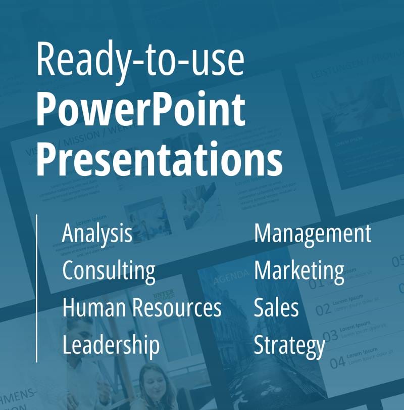
Are you looking for professionally designed slide templates for your report presentation? Take a look around our shop. We have a wide variety of slide templates on numerous (business) topics. You’re sure to find the right slide set for your needs. For example, here’s one for your financial report:

You can find more templates here ► To the shop
These articles might also interest you:
- The Right Way to Use Pie Charts in PowerPoint
- 16 Ways to Kick-Start Your Presentation
- Body Language in PPT Presentations: 8 Tips & Tricks
- Rhetoric Skills: How to Speak and Present Effectively
- Presentation Hack: Always Focus on Your Audience’s Needs
- Because First Impressions Aren’t Everything: 20 Tips and Ideas to End Your Presentation in Style
- PowerPoint Layout: Tips & Tricks Plus 6 Modern Ideas for Your Slide Layout!
- Make a PowerPoint Image Transparent: The Pro Guide
- Icons: An Amazing Way to Improve Your Content
- Preparing a PowerPoint Presentation: 11 Tips for Guaranteed Success!
- 10 Chart Types: Which One Is Right for My Data?
Share this post

-

Design Thinking: Problem Solving with a Difference
-
Why Corporate Mission Statements Are So Important
-
7 Tips & Learnings from the Apple Keynote


-
Design Thinking: Problem Solving with a Difference
-
Why Corporate Mission Statements Are So Important
-
7 Tips & Learnings from the Apple Keynote